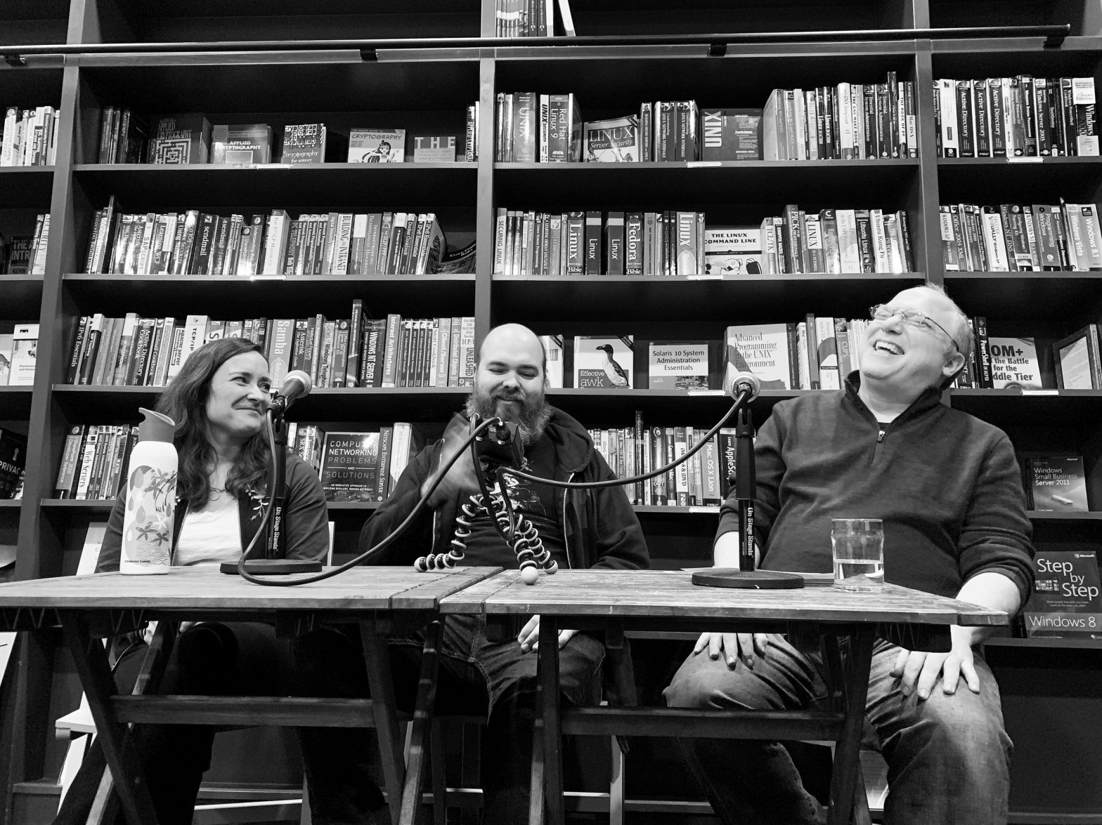
My love of letterpress printing is no secret, and in this episode, I speak to two designers who devote parts of their working lives to modern letterpress. This episode was taped live at Ada’s Technical Books and Café in Seattle on January 23.
Printing didn’t change much from about 1450 to 1950. It became faster, motorized, and blew up to industrial scale, but it was only when the “relief” (or letterpress) method of printing—putting ink on a surface and then pressing paper onto it—was replaced with offset lithography, which relies on flat printing plates and thin films of ink, that everything changed for good. Letterpress printing has remained as a craft, though, and it has thrived in the last 20 years as it’s been rediscovered and taught fresh to new generations.
Two Seattle practitioners have deep ties to this great resurgence of letterpress. We talk about how they got sucked into an old-school printing method and how the medium affects their design and vice-versa.
Sarah Kulfan is a visual designer, illustrator, and letterpress printer. She is the proprietrix of Gallo Pinto Press and Beans n’ Rice where she respectively prints limited edition prints and runs her freelance graphic design business.
Demian Johnston is the Designer and Pressman at Annie’s Art & Press, a letterpress shop in Ballard. At SVC, he teaches both introductory and advanced classes in the letterpress program. His design and illustration work has appeared in The Stranger, Seattle Weekly, City Arts, and Beer Advocate.
Event photo courtesy of Jeff Carlson.
Sponsors
Thanks to the patrons in the crowdfunding campaign who brought the New Disruptors back, and these Disruptor-level backers in particular: Elliott Payne, my friends at Lumi, Kirk McElhearn, Kuang-Yu Liu, and Marc Schwieterman. (Marc, and another Disruptor backer, Kim Ahlberg, attended the taping!) You can become a patron of the show and get a special pin and be thanked on the air, too.
Show notes:
We talk about a lot of concepts and old tech in this show, so the notes are a little more extensive to help you understand some of the things we mentioned just in passing:
- SVC is the School of Visual Concepts in Seattle, where Jenny Wilkson runs the letterpress program. It’s a for-profit analog and digital design school, teaching letterpress, UI/UX, graphic design, copywriting and more. It’s where I had my 2017 design residency, too!
- Demian has a 10×15 Chandler and Price (C&P), which is a workhorse press, manufactured from 1884 to 1964.
- Stern & Faye: Jules Remedios Faye and Chris Stern ran this press together for decades. Jules continues to print and bind, and handbound my book, Not To Put Too Fine a Point on It (copies still available). The C.C. Stern Type Foundry, a working museum in Portland, Oregon, is named for Chris and features a lot of Jules and Chris’s casting equipment.
- “dissed type”: Type distribution is an incredibly tedious part of hand setting type. Each character you pull out of a type case has to be “distributed” back into its original compartment in the case when you’re done with a printing job.
- Ruling pens: These pens were used for making lines, or “rules,” and hold ink in a reservoir between two jaws. The gap of the jaws can be adjusted to create lines of different thickness.
- Plates: Printing plates are solid sheets of metal or plastic made from source material and intended to be printed as a full sheet, sometimes including dozens of pages. Starting in the 1800s, printers would cast metal plates (called “stereotypes”); in more recent decades, printers rely on a rubbery plastic called photopolymer that’s light sensitive. Digital files can be output to high-contrast film and exposed to the plastic plastic, and make a letterpress-printable plate.
- Carl Montford: a local renowned wood block engraver, who has taught thousands of people how to carve linoleum blocks and hundreds how to carve in wood.
- Linoleum blocks: These are really just pieces of linoleum glued to a wood base. A designer carves the linoleum to leave high areas to receive ink.
- Type high: The exact height needed for type and other material on the “bed” of a press to be inked by rollers and press exactly at the right distance into paper. It’s 0.918 inches in America and England.
- Touche plate: This may have been a regionalism, but a “touche” (French, pronounced toosh) is a touch-up plate used to fix an error in offset printing.
- Reduction cut: On a block, you engrave a starting image that prints in the lightest color, carve away details, print the next-lightest color, and so forth. The block is creatively destroyed in the process.
- A “kiss” impression
- Vandercook cylinder presses are the hot thing in letterpress today, originally designed largely as a “proof press”: to pull a copy of a section of text for proofreading, layout, and evenness, before it went on a real press.
- Printing the Oxford English Dictionary (YouTube)
- “Farewell, Etaoin Shrdlu”: The last day of hot-metal Linotype typesetting at the New York Times
- The quote I was trying to recall was from A Short History of the Printed Word, written by Warren Chappell and, in a second edition, updated and extended by Robert Bringhurst. Bringhurst wrote the following devastating sentence about the entire era following relief printing:
In the 1970s and 1980s, the practitioners of photocomposition and offset printing were, like Gutenberg, engaged in a simultaneously innovative and imitative act. But they were not imitating writing; they were imitating printing—and were doing so in a world where reading had become, for most, a passive, cerebral act, unconnected with any physical sense of the making of letters, and unconnected with any sense of the intellectual urgency of publishing.

